Musings from Daily Faceoff’s sartorial expert, Mike McKenna:
I dare anyone that watched Thursday night’s tilt between the Vancouver Canucks and Calgary Flames to argue that it wasn’t the most aesthetically pleasing game in recent memory.
Did you see those beautiful black, yellow, and red Canucks jerseys? How about the clean lines and bold colors of the Flames uniforms? Absolutely gorgeous.

I can’t remember the last time my breath was taken away by the sweaters worn rather than the play on the ice. But it happened on Thursday night. The game was beautiful.
As a child of the 1980’s, I feel lucky to have grown up during an era where jerseys were simple and logos were the main focus. Rarely did a team change their colorway.
And then the 90’s happened and everything got weird. Vancouver put an orca breaking out of the letter ‘C’ on the front of their uniforms. They chose a busy combination of navy, silver, red, black, white, and whatever other colors I am forgetting.
As if that wasn’t enough, Vancouver decided to add the city’s name in script above the orca. And they changed the colors to navy, green, and white.

The Vancouver lettering was on the Canucks jersey when I was a member of the team for two games during the 2018-19 season. But I think they ditched it recently. Right? The script isn’t on their uniforms any longer, is it?
I have to ask because I can’t keep up with the numerous alterations that the Canucks have made. The team has to be among the NHL’s clubhouse leaders in uniform changes.
Vancouver has spent over 25 years chasing their tail trying to find the perfect colorway and logo combination. Which is absolutely ridiculous considering the black jerseys worn on Thursday night should have never gone away.
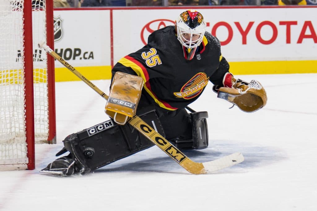
The colors are unique and the black version looks downright mean. Hockey fans from my era all remember seeing Pavel Bure flying down the wing in that uniform.
And who could forget Kirk McLean’s equipment setup? Canucks All-Star goaltender Thatcher Demko sure didn’t. His vintage tribute to Captain Kirk went viral on social media.

Demko made 29 saves on 30 shots to secure his 22nd win of the season. And he looked amazing in doing so.
But what I can’t understand is how teams can be so tone-deaf when it comes to uniforms.
Take the Ottawa Senators as an example. The team spent over a decade wearing what essentially looked like a red practice jersey with a dated 3D Spartan warrior as a logo.

I wore that jersey during the 2018-19 season. And every time I pulled it over my head, I remembered how good the Senators uniforms were during my youth. Those simple black and red jerseys with the bold 2D crest and gold accents. So clean. So sharp. I wanted to wear that sweater.
Which is why I was so happy to see the Senators switch to an updated version of their classic uniform design for the 2020-21 NHL season. Ottawa fans were begging for their return. And for good reason. The Senators could wear their current jerseys well into the future because the design is so clean and timeless.

But the same can’t be said about the Edmonton Oilers jerseys.
What a hot mess. The Oilers uniforms are all over the place. They lack an identity. Which ironically mirrors the team’s’ play on the ice so far this season.
Edmonton’s home orange jerseys are an eyesore. But I understand why they exist. The Oilers wore orange jerseys for the first two years of the franchise’s existence in the WHA. So there’s some historical context. But that doesn’t make the uniform any more appealing.
The white away jerseys are fine. I don’t like the navy, but at least they resemble the traditional sweaters from when the Oilers won the Stanley Cup five times between 1984 and 1990.
As for the alternate navy and orange jersey – it needs to be retired immediately. I think it’s the worst jersey in the NHL – for several reasons.
First. Navy. See a theme here? There is no excuse for the Edmonton Oilers to be wearing navy. Look at pictures from the glory years of the franchise. Beautiful blue jerseys with accenting orange and white.
Second. There isn’t a trace of white on the alternate jersey. It’s a sea of navy and orange, which makes the sweaters look dull and lifeless.
If you’ve ever designed goalie equipment, you learn something very fast. A little bit of white makes the other colors pop. It provides contrast and depth to a design. Both of which are lacking in the Oilers alternate jersey. It’s flat and uninspired.
All the Oilers need to do is look south. Their Battle of Alberta rivals – the Calgary Flames – have figured out the best solution. Go back to the future.
Up until 1995, the Flames had one of the most distinctive colorways in all of hockey. Their simple combination of red, yellow, and white not only looked fierce, it also played perfectly into the fire theme of the franchise.
And then – like so many other uniforms in the 1990’s – things got weird in Calgary. The team added a goofy angled stripe to the front of the sweater and incorporated black into the design. It looked forced and awkward. Yet black remained in the team’s color palette until recently.
Thankfully the Flames realized that their classic look was also their best. Black has been removed from their uniforms. The 90’s have finally been phased out.

Maybe it’s not surprising that I care so much about jerseys. I became a goaltender because I loved the equipment and the freedom to design my own gear. And a team’s colors are crucial in that creative process.
Uniforms should be bold yet simple. Distinguishable but understated. It’s a balance that some NHL teams have figured out, while others are still searching for the right combination.
If I can offer any advice: look at hockey history. It is littered with classic jersey designs begging to be updated or reincarnated. When it comes to uniforms, living in the past isn’t always a bad thing.


