
After playing an entire season under generic names, the inaugural six PWHL franchises have their identities.
The league announced the team’s new brands in a big way on Monday, with the reveals coming on Good Morning America in the United States, and Breakfast Television and Radio-Canada Info. The PWHL made it clear that it wanted names and images that were unique to this league and no one else. The six teams also kept closer to the color palettes that they had in year one, in which the teams were only recognized by the markets they presented–Boston, Minnesota, Montreal, New York, Ottawa and Toronto.
While the jerseys will not be released until later this fall, some our top “marketing experts” at Daily Faceoff are weighing in on the team’s new identities. Check out what Hunter Crowther, Tyler Kuehl, Colton Davies, Mike Gould and Scott Maxwell have to say:
1. Victoire de Montreal (Montreal Victoire)
Hunter: 1st
Tyler: 1st
Colton: 1st
Mike: 1st
Scott: 1st
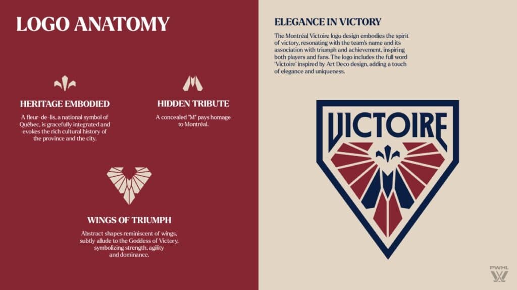
Tyler: I don’t know what it is about Montreal teams and their logos, but they somehow find ways to hit. Whether it be the Canadiens, the Alouettes, CF Montreal, or even the defunct teams like the Force (PHF) and Expos (MLB), they just look sweet, and the colors fit perfectly. The addition of a slight hint of blue coincides with the majority of the franchises that have played in the market, giving them an A+ from me.
Scott: Montreal easily has the best logo of the six teams, so that alone made them an easy first place for me, and I like the team name as well (although I expect it will burn them every time they get eliminated in the playoffs). Also, with the French language placing significant importance on gender in their language, it’s a nice touch for them to pick a feminine word as their team name.
Hunter: Near perfection, no notes, and bless ‘em for not having an English translation for the team name. The fleur-de-lis in the middle, an homage to the Quebec flag, is the cherry on top for what might be the PWHL’s best work through this process.
Mike: Really beautiful. The logo feels like it’s straight out of the ’70s in all the best ways, just like Olympic Stadium and the Montreal Metro. It’s somehow intricate and simple at the same time. I really, really dig it. La Victoire!
2. Toronto Sceptres
Hunter: 3rd
Tyler: 4th
Colton: 6th
Mike: 4th
Scott: 2nd
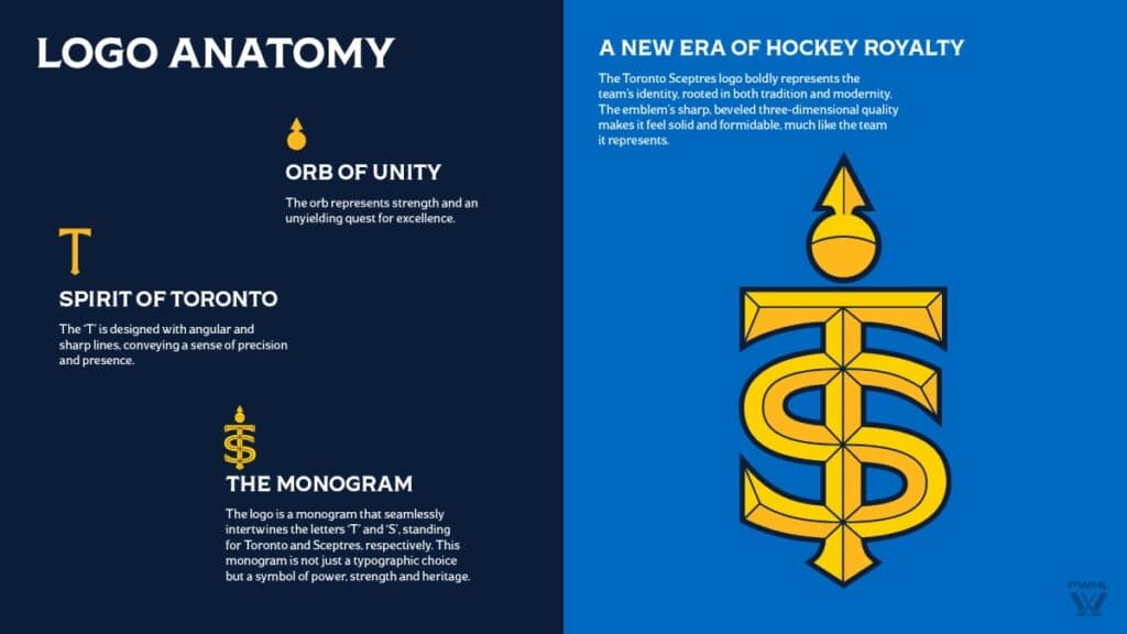
Tyler: Why not have a city that has a King and Queen Street have a team name that is connected to royalty? I honestly don’t mind the name, I just think it will cause broadcasters to jumble their words during games. It is ironic that the new colors resemble that of Toronto Metropolitan University, where Toronto played its regular season home games last year (but the team is moving to Coca-Cola Coliseum in 2024-25). The logo’s not bad, really going for the regal look.
Scott: I think the logo is probably the only other one that doesn’t look like it came out of a logo creator mode in a sports video game, so I can respect that part. I’m less sold on the name, but I still am with most of the teams, so having a more interesting logo places them higher on the list for me.
Hunter: Now I feel like I should have ranked them higher. It’s growing on me. Logos with letters overlaid with one another are fantastic, reminiscent of baseball’s older teams. Even if it does look like one of Taylor Swift’s logos. Also, Sceptres as the team name? Well done. I didn’t see that on anyone’s bingo card when they teased the regal theme.
Mike: I am definitely … sceptical … of “Sceptres” as a name. It’s just kind of awkward. I would’ve gone with “Royals” or “Monarchs.”
3. Boston Fleet

Hunter: 5th
Tyler: 3rd
Colton: 3rd
Mike: 5th
Scott: 3rd
Tyler: I’m not going to lie, the thing that makes me put the Fleet’s logo high on my list is the slight resemblance of the old Hartford Whalers logo. I doubt the designers had that in mind, but I think it’s cool. I was unsure of keeping with the forest green color, but with waves, it works. The name Fleet works well, as it stays with the New England concept of paying homage to the Revolutionary War, while touching on the Boston Harbor.
Scott: The anchor look for the logo definitely favoured this one into the “best of the rest” category for me, but Fleet definitely feels like one of the weaker names.
Hunter: What I like about the Fleet’s logo is that when you boil it down, it’s the Whalers logo on its side. Objectively, the Whalers logo is one of the best in the history of sports, so at the very least, it’s emulating greatness. Points lost because “Fleet” sounds too much like “Fleek” and I’ll never unhear it.
Mike: Remember when the Bruins played in the FleetCenter?
4. Minnesota Frost
Hunter: 2nd
Tyler: 6th
Colton: 2nd
Mike: 6th
Scott: 4th
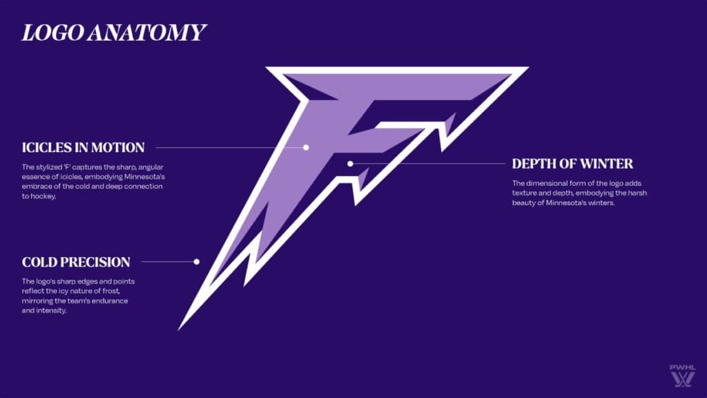
Tyler: I have as much enthusiasm for this new identity as captain Kendall Coyne Schofield had during the press conference earlier this week. The Minnesota Frost does sound like an intriguing Stephen King thriller. The first-ever Walter Cup champion’s new logo is going after simplicity, which, in the state the franchise is in right now, might be what they need.
Hunter: Maybe I’m a sucker for purple, and maybe them being the defending champions is clouding my judgment, but the Frost just seems neat. The finish on the F is crisp, and logos that are letters are always a strong choice.
Mike: It kinad looks like the logo for a gas station Slurpee knockoff called “Mr. Frozen.”
5. Ottawa Charge
Hunter: 6th
Tyler: 2nd
Colton: 4th
Mike: 3rd
Scott: 6th
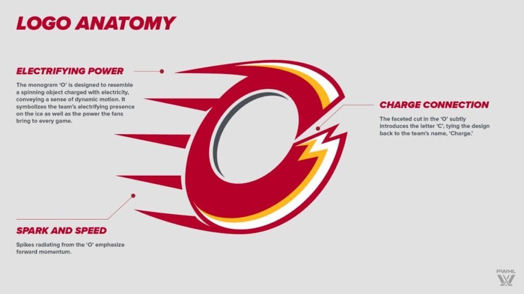
Tyler: I know seeing a slight resemblance to the Calgary Flames will make Mike Gould over the moon, but I have to admit, it works. Of the six fanbases, Ottawa showed up each and every game in the nation’s capital last year. I like how the “charge” of excitement with the team is reflected in the spirit of the logo.
Scott: It looks too much like Andrew Mangiapane’s attempt at drawing the Flames logo for me to take it seriously. The Sirens’ logo is a headache, but at least it looks professionally done, and the name isn’t so good that it saves them from a last-place ranking for me.
Hunter: I’m sure someone wrote it, but this looks like the lovechild of the Calgary Flames and the NBA’s Cleveland Cavaliers. Still, any logo with that “whoosh” look is A-okay in my book, and calling yourself the “Charge” gives you carte blanche to “Dun nun nun nun duh nunnnnnn: CHARGE” chants at every home game.
Mike: It’s so bad, it’s good. It definitely stands out better than the “Minnesota Fleet” or the “Boston Frost” or whatever — I’m already starting to forget which is which. That’s definitely not the case here. Instantly memorable.
6. New York Sirens
Hunter: 4th
Tyler: 5th
Colton: 5th
Mike: 2nd
Scott: 5th
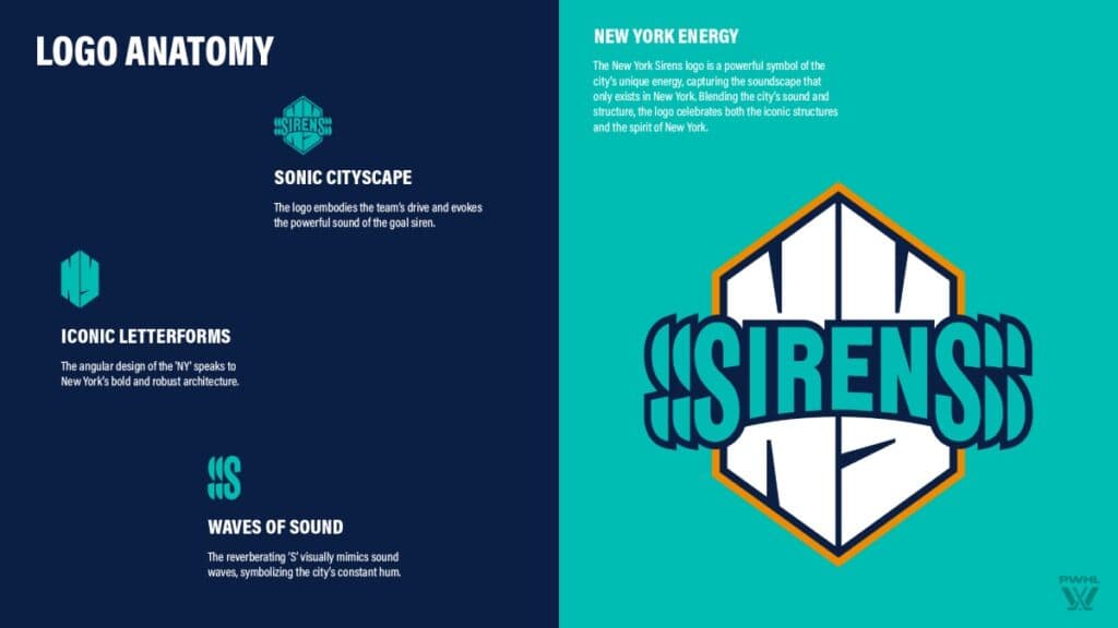
Tyler: I get why they have the layered effect for the Sirens logo, but I’m going to be honest: it hurts my eyes (not figuratively, literally). I think the logo would have looked just fine had it read ‘Sirens.’ The meaning behind the Sirens works, because it seems like you’re always hearing them around the metro New York area.
Scott: Yeah, I don’t mind the Sirens name, and the logo does look interesting, except for the fact that it gives me a headache.
Mike: I dunno. I don’t find it difficult to read. It’s a cool colour scheme and the name is one of the only ones that actually feels like something to me. It stands out.
Hunter: I don’t love it but I don’t dislike it, so No. 4 is the sweet spot. It’s giving mid-‘90s NBA expansion team vibes, like they belong on a pair of pajamas. Still, the echo wrinkle on the sides is a nice finish, and Sirens is a unique enough name to stand out in the crowded New York sports landscape.


